New:http://www.andy.usi-artspace.com/index.htm
Evansville Civic Theatre
After examining the Evansville Civic Theatres website I was convinced that it was not properly representing the Evansville Civic Theatre as a well organized establishment. The site navigation changes when "about us" is selected, the cream colored box around the body text is awkwardly placed over the maroon background, the top navigation panel consists of hard-to-read performance posters and are not distinguished from the cream colored background, the websites vital information was scattered across several navigation links, and entire site was very closed-in and horror-vacui.
My page uses white space as a clean and open spacing solution and decrease eye fatigue. I use white space as a sort of thesis for the entire website. White gives off a clean, sleek, and open feel.
To prevent the white space from completely dominating the site, I added a brown bar at the top of the page . The brown bar was carefully sectioned and modified from its original gradient. The vertical rectangles along the right side of the bar counter the strong horizontal emphasis that the brown bar imposes. By gradually lightening the color as it progresses to the right, the bar loses its dominance over its content and becomes an interesting graphic element rather than a mass of brown housing a logo.
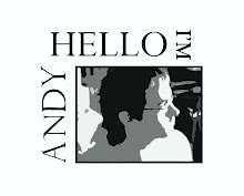
The square logo on the upper left of the brown bar was placed for both nostalgia and balance. With the majority of the page being linear and anti-dynamic, it was necessary to hint at the possibility of dynamic images. The primary logo/title on the brown bar is a modified font that embellishes modest flourishes to counter the strong linear design of the page. The elegant sweeping gesture of the "C" in Civic Theatre" serves three purposes: To wrap around the text below "Civic Theatre", to offset the geometric emphasis of the rectangle binding the whole graphic, and to add elegance to the page. The graphic was made with both the shape of a ticket and a stamp in mind. The rectangle binding the graphic is a common visual element in both stamps and tickets, the small text above and below "Civic Theatre" is a common element of stamps, and the block font of the text above and below "Civic Theatre" is common in tickets. The visual tie to tickets was done for obvious reasons but the tie to stamps may not be as obvious. Stamps, be them inked or paper, are staples of timelessness. Paper stamps are collected for nostalgia and mark a certain time in history. Ink stamps record a certain time in history and are well traveled in that once they are placed on a package or envelope, they travel with the said item until they reach their destination. Stamps relate to theatre in that Theatre marks a set time of history with the vocabulary in its script, can record social issues (dramatized though they may be) of the time, and performances are well traveled in that a single play can be performed worldwide. With this explanation, I hope it is clear why I chose to incorporate the visual elements of stamps into my logo because it would be a shame not to see the relation between stamps and theatre.
The sites navigation has been organized into three distinct fields. The top navigation contains the most basic and well-traveled links. These navigation buttons are bound in ellipses to contrast the horizontal bar above them with organic shape. "This Season" contains any information on the activities pertaining to the current season of the Evansville Civic Theatre. "Community" contains in-site links to any pages relevant to community related subjects such as donating -a link that the original site did not contain- or participating.
A unique page to this site is the Performances page (http://www.andy.usi-artspace.com/Performances%20page.htm). A muted grey rectangle starts where the performance posters begin and extends to where the posters end. This rectangle was placed to harmonize with the rectangular performance posters and to give the text below the posters something to brace against.
The titles on each page are aligned to the right of the page as opposed to the traditional left alignment. I did this to prevent the page from resembling a template ,to break from tradition, and to offset the weight of the page i.e. to prevent the page from being left-side dominated. With the left navigation bar being as long as it is, I felt that the page needed something on the right side. The page title does its job more efficiently on the right side of the page because it is not competing with the navigation bar on the left. The title size is large enough to distinguish itself as a title but not so large that it dominates the body text.
Overall, my website is simple in appearance but is the product of hours of musing over the strategic placement of text. Since theatre is an extremely visual media it was important to contrast it with the opposite extreme to give it balance. I would categorize my site as minimalism. With each element placed, new troubles emerged and other visuals no longer did their job. The main trouble with a dominantly open spaced website like mine is that if the visual elements are not placed in such a way that they maximize the ascetic value of the elements around them, then they ruin the rest of the page. In short, whatever element doesn't add to the ascetic value if the page is ,by nature, subtracting from it. This concept is difficult enough with images but it raises newer and greater troubles with text. Since text is spaced, it shows the white background behind it and has trouble competing for the foreground. When placed with precision and balance, text can potentially bring more beauty than an image; I would like to say that this is the case with my website, so I will.
I would challenge the person who calls this layout conservative or claims that little work was put into the design. This design is not conservative because the maximum amount of spacing and text has been applied to ensure both symmetrical and asymmetrical balance remain in-tact. It would have been much easier to use images in this website but that would have been highly unoriginal because theatre traditionally incorporates images.
I decided to make the bold move of putting text in the spotlight rather than the image because theatre does the exact opposite. In a performance, an actor or actress recites their lines but the emphasis still remains on the visual performance rather than the script. With such an unbalanced emphasis it seems only natural to balance it with the opposite gesture: to emphasis text supported by visual. Since text was the new visual for this site it became necessary to make it as ecstatically pleasing as possible. With no image to accompany it, the text needed to be perfectly balanced in as many ways as possible. The solution is simple shapes and colors that support -not dominate- the text on each page.
So,
By using a surplus of white space to create a clean but not sterile background, the text becomes easy to focus on. The white space is still noticeable while reading the text, fulfilling the goal to balance the open space with text.
And to those who say "Your page is too open", "There is too much white space", or "This looks like it was done at the last minute"...
Thus I refute thee
No comments:
Post a Comment