
What I wanted to do,What I did, Why I did it, and What I could have done
- What I wanted to do
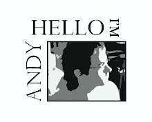
The main feature of this design is the strong horizontal lines and shapes.
- The text acts as the strongest horizontal and it is supported by the title and upper right image. In order to keep the viewer focused on the text, a powerful vertical barrier (image on the left) combines with the title and upper left image to frame the text.
- To keep the title interesting I placed an image under the “A” in Art for no other reason than improving aesthetic value. Because the text needs to be the “first read” of this composition, I gave it highlights to make it unique from the rest of the visual elements
- The background image makes the negative space interesting and unites the rest of the images with a common theme.
If I wasn't concerned with a professional appearance as my main goal, the project would look like this.

No comments:
Post a Comment