-The Good
The paint tubes at the top of the page is a clever and unique graphic element that is both visually stimulating and works well with the theme (i.e. Art Club).
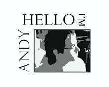
The title is both visually stimulating and informative. The lumpy, paint-like texture goes very well with the title and the highlights give a very nice three diminutional effect.
The heading under "USI Art Club" is very brief yet very informative. It gets straight to the point of most viewers concerns regarding entry fees.
The heading under the body text "Join us Wednesdays at 9 p.m" very briefly gives the information that needs to be given to the viewer that quickly glances over the webpage.
The pencils and pens to either side of the body text are a clever way to block the readers eyes from moving away from the text. Though the artist could have used a box to serve the same purpose, it would not be nearly as esthetically pleasing and would not visually link to the theme. It is this critics opinion that the pens and pencils are the most clever visual element used on the page.
-The Bad
The paint tubes and paint used to write the title are not supported by an equally stimulating background. If the background perhaps had a texture such as a painters pallet or an easel then it would offset the visual information given by the paint and tubes.
The white text is straining on this critics eyes. I find it hard to stay focused on the text with such a harsh contrast. If the background were white and the text were black then this would not be a problem but such as it is, the text is fatiguing.
http://mtravis.willyworld.org/
-The Good
The body text(s) are simple and straight to the point. All the most necessary information is provided and is easy to read.
The graphic elements on the notebook and notebook paper relate to the theme (i.e. Art Club) and look hand-rendered, adding to the gritty feel of hand drawn art.
-The Bad
The title is difficult to distinguish from the corn kernels. If the title were a color farther away from the yellow tint of the corn kernels then it would be easier to read assuming that the hand rendered letters were less sporadic and more evenly kerned with each other.
Though this critic understands how the corn relates to the theme, it should be assumed that the casual page viewer knows nothing of Art Club. As such, the corn seems out-of-place as it is not relevant to, and not mentioned in, any of the body text. The corn detracts from the muted tones of the notebook and the background with its comparably vivid colors.
http://www.kyletieken.com/
-The Good
The information provided by the body text in the would-be bullet points ( -- ) make skimming over the page easy.
The title is very easy to distinguish from the background and body text.
The visual elements relate to the theme (i.e. Art Club)
-The Bad
The body text is spaced too far apart to sustain this critics attention. I found my eyes aimlessly wandering around the page and focusing on the background texture as apposed to the text.
The body text is not bold enough to adequately contrast with the harsh white middleground of the notebook. If the notebook were given a low opacity texture and the text were vertical,given one color, and a bolder font, then the body would be easier to distinguish and would stand out from the middleground in this critics opinion.
The visual elements are not very prominent in the webpage and are overpowered by the solid white middleground.
The pencil does not mesh well with the flat, two dimensional motif of the page.
No comments:
Post a Comment